

Every SEO report has one job: help someone make a better decision. Yet many reports end up as long spreadsheets full of clicks, impressions, and keyword positions that nobody reads past the first page. Clients get confused, managers lose interest, and the insights that could grow organic traffic stay buried in the data.
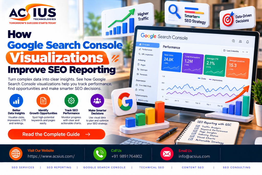
Google Search Console (GSC) is the most reliable free source of search performance data, and its visualizations change how that data is read. Trend lines, comparison charts, filtered graphs, and color-coded status reports turn raw numbers into a story that anyone can follow. This guide explains how GSC visualizations improve SEO reporting, which charts matter most, and how to use them to prove results and plan your next move.
Why Traditional SEO Reporting Falls Short
Traditional SEO reports usually suffer from three problems: too much data, too little context, and no clear next step. A table with 5,000 queries tells you nothing until someone sorts, filters, and interprets it. By then, the reporting cycle is over and the opportunity may have passed.
Static exports also hide movement. A keyword that ranked at position 12 last month and sits at position 7 today is a win, but a flat table of current positions will not show it. Without trend visibility, you cannot separate seasonal dips from real problems or tell whether a content update actually worked.
Visualizations solve this by making patterns visible at a glance. A rising line signals growth, a sudden drop signals trouble, and a cluster of dots in a certain range signals opportunity. When your reports show these signals clearly, stakeholders trust the numbers and act on them faster.
What Google Search Console Actually Measures
GSC reports on how your site performs in Google Search. Its four core metrics are:
- Total clicks: how many times users clicked through to your site from search results.
- Total impressions: how often your pages appeared in search results.
- Average CTR: clicks divided by impressions, showing how compelling your listings are.
- Average position: the typical ranking position of your pages for the queries they appear for.
Each metric tells part of the story. Impressions show visibility, clicks show actual traffic, CTR shows how well your titles and descriptions work, and position shows ranking strength. The Performance report lets you toggle these metrics on and off in one interactive graph, so you can see how they move together. A rise in impressions with flat clicks, for example, usually points to a CTR problem rather than a ranking problem.
The Performance Graph: Your Reporting Foundation
The Performance report graph is the most useful visualization in GSC. It plots clicks, impressions, CTR, and position over time, with date ranges from seven days to sixteen months. The comparison feature lets you set two periods side by side, such as this quarter versus last quarter, or this month versus the same month last year.
For reporting, year-over-year comparison is especially valuable because it removes seasonality. A travel site will naturally see traffic spikes in summer, and a retail site will see them before holidays. Comparing against the same period last year shows whether growth is real or just the calendar.
Businesses that rely on professional SEO Services India often get reports built around exactly this kind of period comparison, because it connects day-to-day optimization work to measurable movement in traffic. When an agency can point to a graph and say “this is where we published the new content cluster, and this is what happened to impressions afterward,” the value of the work becomes obvious. That is the difference between reporting activity and reporting results.
Filtering by Query: Finding Opportunities Visually
Raw query lists are overwhelming, but GSC’s filters make them manageable. You can filter by query text, page, country, device, and search appearance, and the graph updates instantly to show only that slice of data.
One of the most practical reporting techniques is to filter for queries where average position falls between 8 and 20. These are keywords that already rank on the edge of page one or the top of page two. On the graph, you can see impressions are healthy but clicks are low. These are your quick-win opportunities: a better title tag, a stronger internal link, or an expanded section of content can push them onto page one.
Another useful filter separates branded from non-branded queries. Branded queries (people searching your company name) show brand awareness, while non-branded queries show real SEO growth. Visualizing the two separately keeps a strong brand from hiding weak organic discovery, and it gives stakeholders an honest picture of how well the site attracts new audiences.
Page-Level Visualizations: Know What Content Works
The Pages tab shows which URLs earn the most clicks and impressions. Combined with the graph, you can see how an individual page changes after a content refresh, a redesign, or a new backlink.
For reporting, this is where cause and effect become visible. Select a single URL, view its 90-day trend, and you can show exactly how an optimized blog post climbed. You can also spot declining pages early. A page that slowly loses clicks over three months is a candidate for a refresh before it loses its position entirely.
Page-level data also helps you decide where to invest. If three product guides drive most of your organic traffic, those guides deserve regular updates, supporting content, and internal links. If dozens of pages earn almost no impressions, they may need consolidating, improving, or removing. Visual page reports make these decisions faster and easier to justify.
Device and Country Breakdowns
Mobile-first indexing means device performance matters more than ever. GSC lets you compare clicks and impressions across mobile, desktop, and tablet, and the visual split often reveals problems that overall numbers hide. If mobile impressions are high but mobile CTR is far below desktop, your mobile snippets or page experience may need attention.
Country breakdowns work the same way. A site might see unexpected impressions from regions it does not serve, or it might discover an underserved market where it already has visibility. Both insights come from a simple chart view, and both can reshape a content or targeting strategy.
Visualizing Local Search Performance
Local businesses have specific reporting needs. They care about performance in particular cities, service areas, and “near me” style searches. GSC does not label local queries on its own, but you can filter queries by location terms such as city names, neighborhoods, or phrases like “near me” and “in [city]” to build a local view of your data.
Plotting those filtered queries over time shows whether your local visibility is growing. For brands targeting regional customers, combining this with a strategy built around local seo india helps ensure that location pages, Google Business Profile signals, and local citations all support the search terms visible in your reports. When a service page for a specific city shows rising impressions and climbing average position, you know your local optimization is working. When it stalls, the graph tells you where to focus next.
This kind of reporting is also easy to explain to non-technical owners. A shop owner may not care about average position, but they understand a chart showing more people finding their business when searching in their city.
Reporting for E-commerce Websites
Online stores have large catalogs, which makes reporting difficult. Thousands of product and category URLs generate huge volumes of query data, and a single table cannot show which parts of the store are growing. GSC visualizations help by letting you filter by URL patterns, such as /category/ or /product/, and compare their performance as separate groups.
This is where specialized E-commerce SEO Services pay off, because category pages, product pages, and faceted navigation each need different optimization and different reporting. Visualizing category-level impressions shows which product lines are gaining search demand. Filtering product pages by position range shows which items sit just off page one and could benefit from richer descriptions, reviews, and structured data.
GSC’s search appearance filter also helps online stores. You can see how much traffic comes from rich results such as product snippets, review stars, and merchant listings. Charting that traffic before and after implementing structured data gives you clear proof that markup improvements worked.
Indexing and Coverage Charts
Not every SEO issue is about rankings. If pages are not indexed, they cannot appear in search at all. The Pages (indexing) report in GSC uses stacked charts to show how many URLs are indexed and how many are excluded, along with the reasons: crawled but not indexed, blocked by robots.txt, duplicate without canonical, soft 404, and more.
For reporting, these charts act as a site health monitor. A sudden jump in excluded pages after a site migration, a CMS update, or a template change is visible immediately. Including an indexing chart in each monthly report ensures that technical problems are caught early, before they affect traffic.
The sitemap report adds another layer by comparing submitted URLs against indexed URLs. A big gap between the two usually points to quality or crawlability issues worth investigating.
Core Web Vitals and Page Experience Visuals
The Core Web Vitals report groups URLs into good, needs improvement, and poor categories for both mobile and desktop. The color-coded chart makes it easy to see how many pages pass performance thresholds for loading speed, interactivity, and visual stability.
In reports, this visual helps teams prioritize technical fixes. If hundreds of URLs share the same issue, such as a slow Largest Contentful Paint caused by one oversized template element, fixing it once can move a whole group of pages into the good category. Tracking the chart over time also proves that technical improvements deliver results, which is essential for justifying developer time.
Taking GSC Data Further with Looker Studio
GSC’s built-in charts are excellent for analysis, but reporting to clients or executives often needs a cleaner, more customized presentation. Looker Studio (formerly Google Data Studio) connects directly to Search Console and lets you build dashboards that update automatically.
A good SEO dashboard might include:
- A scorecard row showing clicks, impressions, CTR, and average position with period-over-period change.
- A time-series chart of clicks and impressions.
- A table of top queries and top pages with conditional formatting.
- A device and country breakdown.
- A branded versus non-branded comparison.
Automation saves hours every month. Instead of exporting CSV files and building charts by hand, your report refreshes itself, and stakeholders can open it any time. Filters and date selectors let them explore the data without needing to ask you for a custom export.
Best Practices for Visual SEO Reporting
Good visuals do not appear by accident. A few principles will make your reports clearer and more persuasive:
- Lead with the story, not the chart. State the conclusion first, such as “Non-branded clicks grew 34% year over year,” then use the visual as proof.
- Compare periods. A number without a comparison has no meaning. Always show change against a previous period or last year.
- Keep each chart focused. One chart should answer one question. Too many metrics on one graph create confusion.
- Annotate key events. Mark content launches, site migrations, algorithm updates, and campaigns so readers can connect actions to results.
- Tie metrics to business goals. Traffic matters because it leads to leads and revenue. Pair GSC data with conversion data where possible.
- Add recommendations. Every report should end with clear next steps based on what the charts reveal.
Common Mistakes to Avoid
Even with great tools, reporting can go wrong. The most common mistake is focusing on average position alone. Because it averages across all queries, it can drop even when performance improves, for example when you start ranking for many new long-tail terms at lower positions. Always read it next to clicks and impressions.
Another mistake is ignoring data limitations. GSC retains only sixteen months of data, so reports should be exported or connected to a data warehouse for long-term tracking. Sampling and anonymized queries also mean totals may not match exactly across views.
Finally, avoid vanity reporting. A chart of rising impressions looks impressive, but if clicks and conversions do not follow, the growth has little business value. Honest, balanced reporting builds long-term trust.
Conclusion
Google Search Console visualizations turn complicated search data into clear, actionable reporting. Performance graphs show trends, filters reveal opportunities, page-level views connect content to results, and indexing and Core Web Vitals charts protect your technical foundation. When these visuals are organized into a clean dashboard with context and recommendations, SEO reporting stops being a monthly chore and becomes a growth tool.
If you want reporting that clearly connects strategy to results, partnering with an experienced team makes a real difference. ACSIUS combines data-driven SEO strategy with transparent, visual reporting so businesses can see exactly what is working, what needs improvement, and where the next opportunity lies. Start using Search Console visualizations in your reports today, and let your data tell a story your whole team can act on.
FAQs
How do GSC visualizations make SEO reports easier to understand?
They replace long spreadsheets with clear trend lines and comparisons. A rising line, a sudden drop, or a cluster of keywords near page one is far easier to spot in a chart than in a table of thousands of rows, so clients and managers can understand results without technical knowledge.
Which GSC chart is most useful for SEO reporting?
The Performance graph. It plots clicks, impressions, average CTR, and average position over time, and its date comparison feature lets you set two periods side by side, such as this quarter versus last quarter or this year versus last year.
How can I find quick-win keywords using Search Console?
Filter queries to an average position between 8 and 20. These keywords already rank near page one but often have low clicks. The graph shows healthy impressions with weak CTR, which signals that better title tags, internal links, or expanded content could push them higher.
Why is year-over-year comparison important in SEO reports?
It removes seasonality. Traffic naturally rises and falls with holidays, weather, and industry cycles. Comparing against the same period last year shows whether growth is real or just a result of the calendar.
Can I separate branded and non-branded traffic in GSC?
Yes. You can filter queries that contain or exclude your brand name. Viewing them separately shows how much traffic comes from people who already know you versus new audiences discovering you through search, which is a more honest measure of SEO growth.
How do I use Search Console for local SEO reporting?
Filter queries by city names, neighborhoods, or phrases like "near me" and "in [city]." Plotting these over time shows whether your local visibility is improving. You can also filter by country and by individual location pages to see which service areas are gaining traction.
How can e-commerce sites use GSC visualizations?
Online stores can filter by URL patterns such as /category/ or /product/ to compare how each section performs. The search appearance filter also shows traffic from rich results like product snippets and review stars, helping prove the impact of structured data.
How long does Google Search Console keep data, and how can I keep it longer?
GSC stores about sixteen months of performance data. To track long-term trends, export your data regularly or connect Search Console to Looker Studio or a data warehouse such as BigQuery so historical data is preserved.
How do I turn GSC data into an automated SEO dashboard?
Connect Search Console to Looker Studio as a data source. Then build a dashboard with scorecards for clicks, impressions, CTR, and position, a time-series chart, top queries and pages tables, and device and country breakdowns. The report refreshes automatically, saving hours of manual exporting each month.
